- Feb 11, 2019
 0
0- by A2 Marketing Team
Improving conversion rates is vital for any business, no matter its size. There are a lot of factors that go into securing conversions, however, so it can be difficult to pinpoint possible areas for improvement.
Fortunately, implementing A/B testing can help. This enables you to directly compare two variants of content on your website – changing one element such as text size, button color, or featured image. By displaying two slightly different versions of the same site to distinct groups of users, you can determine which works best at encouraging conversions.
In this post, we’ll discuss the basics of A/B testing, highlight some key examples, and explore the benefits it can have for your site. Let’s get started!
An Introduction to A/B Testing
One of the many benefits of the digital age is that there are now more budget-friendly options for conducting research. In the past, it would have been expensive to run comparison tests – and the cost of holding focus groups and interviews soon adds up too. These days, A/B testing provides affordable insights into visitor behavior, which can significantly increase conversion rates.
Put simply, A/B testing is the direct comparison of two possible options. The content that’s tested can be pretty much anything, from a single web page to a specific design feature or advertisement. To conduct an A/B test, all you need to do is modify one element of the content in question, creating two nearly-identical versions that differ in one way. Some changes that are commonly tested include website colors, various Call To Action (CTA) button characteristics, and size of text.
Once you have two versions in hand, you’ll need to randomly display each to 50% of your site’s visitors. Then, you can track which version performs better, via whatever metric(s) matter to you. At the end of the test, you’ll know which change to make permanent, and which to discard.
3 Reasons to Run A/B Tests on Your Website
A/B testing is an excellent way to get inside the minds of your users, and directly respond to their needs and wants. In fact, using this method can benefit your site in more ways than one. Let’s explore some of the key advantages it offers.
1. It’s Easy to Analyze the Results
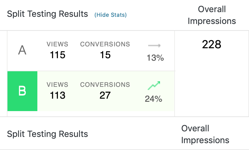
One of the best things about A/B testing is that it makes it simple to collect real, concrete results. The data gathered through this kind of testing enables you to clearly determine what designs and copy work best for your audience:

A/B testing reduces the risks inherent in big decisions like pricing and strategy. It’s much more cost efficient to run a test and find out what will produce results, than to simply guess. That makes this method particularly useful for smaller website and business owners.
In addition, A/B testing doesn’t require an abundance of responses to be considered worthwhile. Other research methods, such as surveys, require a large volume of results to determine the ‘right’ answer. With A/B testing, on the other hand, you’re only analyzing two options, which vary in one distinct way. This means you should be able to determine a clear ‘winner’, regardless of the response rate.
2. You’re Likely to See a Boost in Conversions
The ultimate goal of just about any business website is to increase conversions, and your website content plays a huge part in making that happen. A/B testing is the easiest, and perhaps most effective, way of determining what kind of content leads to the most conversions:

This is particularly relevant when it comes to the ‘actionable’ parts of your website, as these are the elements that directly lead to conversions. “Add to Cart” CTAs are an example of this in action, and are something you could test by changing their color or text. You can even try slightly altering the price of your products, to see if that results in more purchases.
Once you know which versions of your content and CTAs are best for business, you can push out the changes site-wide. In turn, this should lead to an improved level of engagement and conversions.
3. You Can Quickly Identify Areas for Improvement
In a general sense, regular analysis of your site can aid you in identifying potential problem areas, and investigating why they aren’t working. A/B testing is a perfect way to identify and deal with those issues, thanks to its flexibility.
The process of A/B testing leads to better website content, because it helps you determine what elements are valuable and why. ‘Value’ can be measured in a number of ways – such as by changing the length of your content. If long blog posts receive low numbers of shares and comments, try shortening them. If engagement increases, you’ll know that your audience prefers that style of writing.
Paying attention to the needs and wants of your audience also helps you provide a better overall service. This is crucial, since a stronger user experience often leads to more sales down the line.
How to Start Using A/B Tests on Your Website
If you want to reap the benefits of A/B testing, all that’s left is to set one up. There are many ways to do this. First and foremost, however, you’ll need to decide what to test.
Some of the simplest A/B tests you can run involve minor changes to key elements. However, changing button sizes and colors can only tell you so much. For best results, you’ll want to consider more complex tests, such as:
- Changing CTA text, to see what gets more clicks.
- Adjusting the length of blog posts and other written content.
- Displaying different headlines, and measuring the resulting engagement.
- Adding various imagery and even videos.
After that, you can simplify the A/B testing process through the use of a dedicated plugin. WordPress Calls to Action and Nelio A/B Testing are two excellent examples, each of which can help you set up tests, run them, and measure the results.
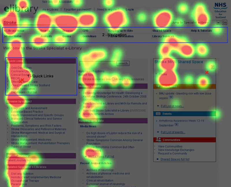
It’s worth noting that while A/B tests are invaluable, and can help you make key decisions, they don’t offer much insight about the overall effectiveness of your site. For example, experimenting with your website’s layout by placing specific content above and below ‘the fold’ can help you determine where it receives the most interaction:

This can be done through the use of ‘heatmaps’, which track what parts of your site receive the most (and least) interaction. While not strictly a form of A/B testing, heatmaps are an excellent complement. They provide further insight into why two options may have performed differently, and reveal the actual way visitors are using your web pages. This technique is also simple to implement, by using a tool such as Crazyegg.
Conclusion
If you offer products or services on your site, it’s likely that you’re always looking for ways to increase conversions. Although many factors go into maintaining a high conversion rate, a well-designed website remains at the top of the list. A/B testing enables you to directly compare two elements on your site, meaning you are able to determine which works best at driving sales.
In this post, we’ve covered three key reasons you should consider running A/B tests on your website:
- A/B testing enables you to gather real, concrete data with ease.
- Identifying what change produced desired results can lead to a boost in conversion rates.
- Running targeted tests on your site can help you pinpoint key areas for improvement.
Image credit: Flickr.


