- Dec 27, 2016
 0
0- by A2 Marketing Team
A high-quality portfolio site can open up a lot of career opportunities, especially if you’re a freelance professional. However, it could be said that having an unappealing portfolio is worse than not having one at all. After all, salvaging a first bad first impression can be an uphill battle.
While no two portfolios are the same, most of the great ones share a few key features. If you can get them right, your odds of impressing prospective clients will increase exponentially.
In this article, we’ll cover three key factors that make for an excellent portfolio, provide you with examples for each, and then show you how to implement them. Let’s dig in!
1. A Simple Design
When it comes to portfolios, as far as design goes, your best bet is to keep things simple.
In practice, this means creating a website that is simple to navigate and interact with. A lot of people go too far by cramming their portfolio with animations and other flashy design elements. While flashiness can be good if you need to catch someone’s eye, you also need to provide an usable experience for your visitors.
Research has shown that simple websites convert more users and are consistently rated as more attractive. The easier your design is to navigate, the better your results will be as a whole. Furthermore, potential clients will be able to find the information they need faster.
Check out this example of a simple yet effective design:

Fig Tree Design Studio features a very straightforward layout. Considering it’s a web design studio, you’d expect something more complex, but in this case, simple works.
It’s important to note that simple doesn’t necessarily mean unattractive; a decent layout with a good color palette goes a long way. Take a second look at our example above if you don’t believe us.
One other thing about simplicity – when it comes to navigation, only include truly relevant pages and information. There’s no room for filler content when it comes to something as critical as your portfolio.
2. Easy to Access Contact Details
Aside from showcasing your projects, your portfolio’s primary function should be to make you more accessible. Contact details should be featured prominently in places where your visitors can easily find them.
Let’s check out a real life example of a portfolio that pulls this off:

From a visual standpoint, The Beast is Back offers a very eclectic portfolio. Just as importantly, it does an excellent job of clearly displaying contact information – with links to all of the author’s social media profiles, as well as a link to a dedicated contact page.
The simple (yet effective) contact page aside, each of the social media icons provides the prospective client with a means of getting in touch. While you shouldn’t necessarily choose to be active on a plethora of social media networks, the more means of contact you have, the fewer barriers there are in place between you and your next client.
Adding a contact form to your portfolio is a relatively straightforward affair. Most platforms provide you with tools to do so, but if you’re looking for a universal solution, we recommend 123 Form Builder. All you need to do is generate a form and copy some HTML code into your site to get yours up and running. As for social media, AddThis enables you to add social follow buttons to your website using a similar process.
3. Straightforward Service and Pricing Details
If a prospective client is taking the time to check out your portfolio, chances are they might be interested in hiring you. It’s your job to make that process as simple as possible.
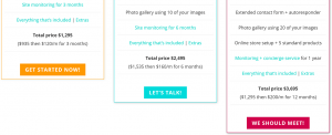
Being straightforward about what services you offer, how your process works, and your rates are all good ways to gain a client’s trust and get them to consider hiring you. Here’s an example of what that might look like:

Leumen Design does a particularly good job of outlining exactly what you get with each of their plans. They provide a breakdown of what each service entails, who might benefit the most from them, their prices, and even payment plans. That’s being thorough.
A lot of freelancers choose to forgo this approach and instead wait for clients to contact them, but we’re not fans of that tactic. Not mentioning details about how your service works might dissuade clients from contacting you in the first place by thinking they can’t afford your rates.
Dedicating a single page to outlining your services and prices is the simplest approach to take here. However, for efficiency’s sake, we recommend that you consider using pricing tables if they’re a good fit for your field of work. Coveloping’s Pricing Table Generator enables you to create them quite easily. If you’re using WordPress, follow this guide to get yours up and running.
Conclusion
No single portfolio will please every potential client out there. As a professional, the best you can do is follow good practices to increase your odds of success. If you follow the advice we’ve outlined during this article, your portfolio will be all the better for it.
Let’s quickly recap the three key factors, discussed above, that make for a great portfolio website:
- A simple design.
- Easy to access contact details.
- Straightforward service and pricing details.
Image credit: Pixabay.


