- Apr 29, 2020
 0
0- by A2 CMS Team
These days, an increasing number of people browse the internet primarily using their cell phones or tablets. In fact, a whopping 52% of all website traffic comes from phones. If your Drupal site isn’t optimized for mobile devices, this means half of your visitors may end up viewing a squished, non-functional version of your site.
Fortunately, there are tools in place to help you build a more responsive website with Drupal. Developers have created modules that enable you to include vital elements such as a mobile menu. With a little effort, you can optimize your site so that it looks and works well on smaller screens.
In this article, we’ll explain how to optimize your Drupal site for mobile devices in five steps. Let’s get moving!
Why It’s Important to Optimize Your Site for Mobile Devices
A website designed for desktop use can appear unreadable on a phone or tablet. Therefore, it’s important to ensure that your site is mobile-friendly, and looks its best no matter how viewers access it.
There are plenty of benefits to optimizing your site for mobile devices, such as:
- Improved loading times, which is crucial on cell phones.
- The unlikeliness that users will abandon a website that takes longer than a few seconds to load.
- Sites being able to benefit from improved Search Engine Optimization (SEO).
Fortunately, it’s not too hard to optimize your Drupal website for mobile devices. All it takes is a little time, and a few particular modules.
How to Build a Responsive Website With Drupal (5 Key Techniques)
The following tips will help you make your Drupal website mobile-friendly. We’ll be assuming that you already have at least a basic Drupal site up and running.
If you are new to Drupal, you may want to hire a developer for help with some of these steps. However, even if you end up using a developer, this guide can help you familiarize yourself with the key vocabulary, so you know exactly what to ask for.
1. Install a Mobile Menu
First, it’s important to have a menu that’s optimized for mobile devices. This will ensure that your navigation links display properly on narrow screens.
Perhaps the most popular style of mobile menu is the ‘hamburger’ icon. When the screen shrinks to a certain width, the menu is replaced by a simple icon with three horizontal lines. When you click on the icon, it displays the site’s main menu in a mobile-friendly stack:
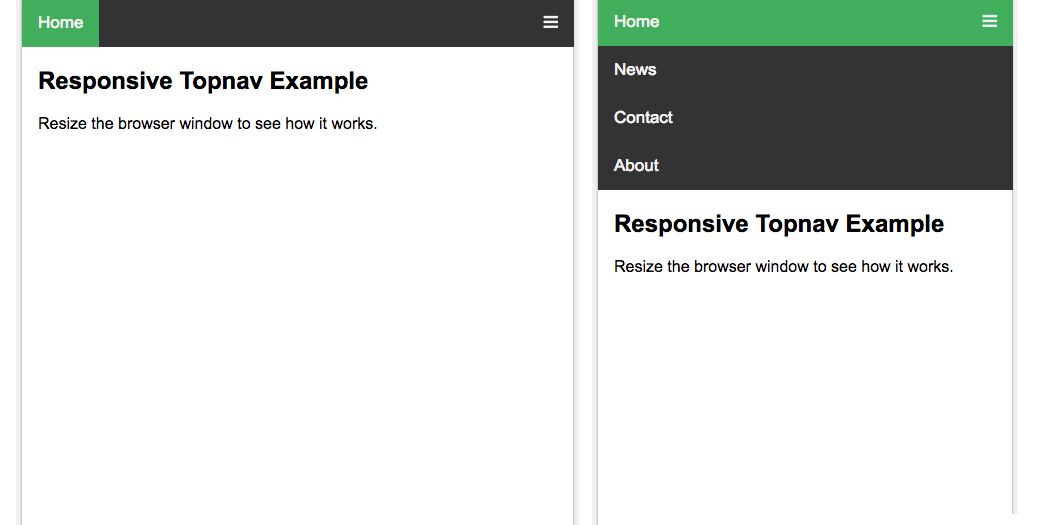
You can add this type of menu by installing the Responsive Menus module. On the module page, download the tar.gz file. Then in your dashboard, click on the Extend tab:
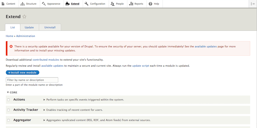
Next, select the Install New Module button, and upload the tar.gz file using the file browser. You should be ready to start using the module to style your site’s menu now. Keep in mind that you can also configure the module if you like, as part of the installation process.
2. Minify Your Code
As we mentioned earlier, it’s vital for mobile sites to load quickly. JavaScript, CSS, and HTML files for a large website can get bulky. ‘Minification’ is the process of removing unnecessary elements from your site’s code, so that it will render more quickly and enable faster loading times.
You can minify your code by installing the Minify module on your site. Visit the module page, download the tar.gz file, and unarchive it on your computer:
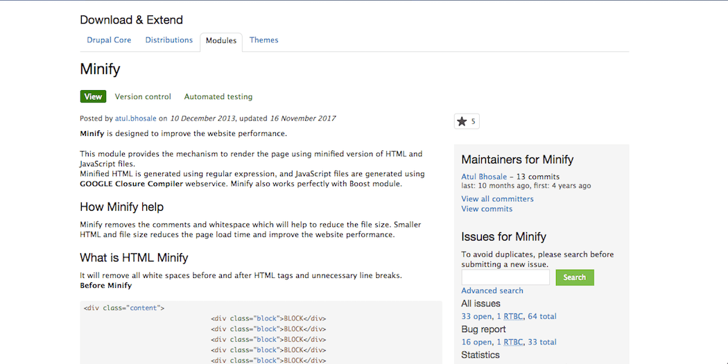
Then, move the resulting folder into your site’s Drupal modules/ section. After that, you can enable the module by going to Administration > Modules in your dashboard, and selecting Enable Newly Added Modules.
Check the enable box next to the minify module to start it working automatically. This should help your site load faster on mobile devices (and desktops as well). You can also configure the module by visiting Administration > Configuration > Performance and following the prompts there.
3. Implement Browser Caching
Next up, browser caching is a way of storing data so that a visitor’s browser doesn’t have to download the same files repeatedly. Caching tells browsers to ‘save’ certain information, so that it doesn’t need to requested and transferred every time a visitor opens a new page on your website (or re-visits it at a later date).
For example, if your site has a large background image, it might slow down your pages’ loading time. However, with browser caching, that file could be stored locally on each visitor’s device, so it only needs to be downloaded once.
In Drupal, browser caching is a built-in tool that you can configure in your control panel by visiting Administration > Configuration > Development > Performance:
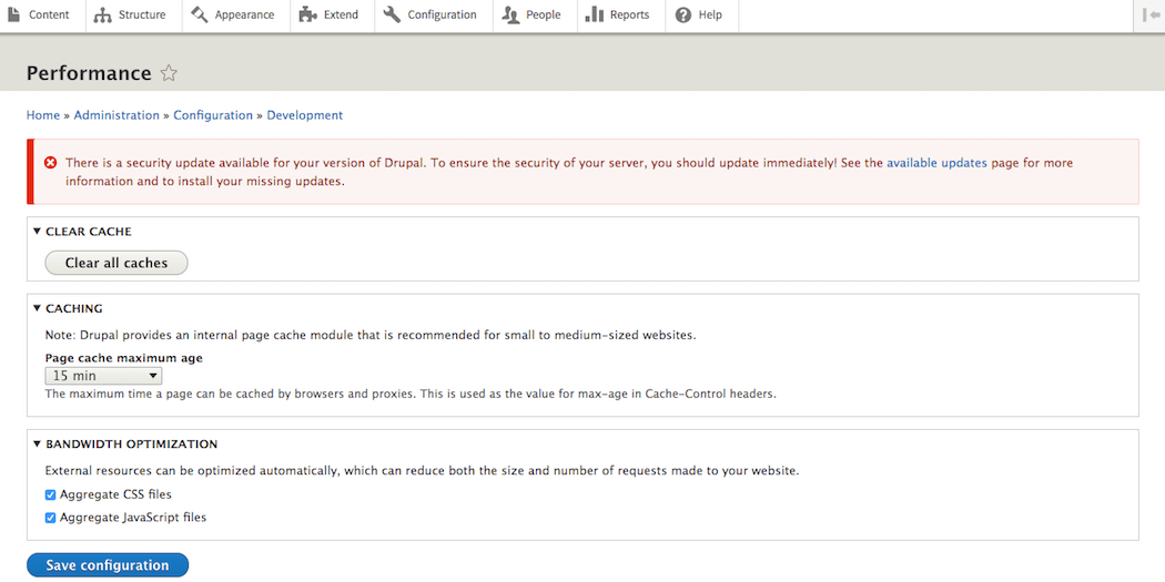
We’d recommend following the official guide to learn how to set up caching and what the different settings mean.
4. Optimize Images
If your site has a lot of large image files, it may take longer to load on mobile devices. Therefore, another way to speed up your site is to optimize your images, which lets you reduce their files sizes without compromising on quality.
There are plenty of easy ways to optimize images before uploading them to your site. You can also optimize images in Drupal itself, by using the ImageAPI Optimize module:
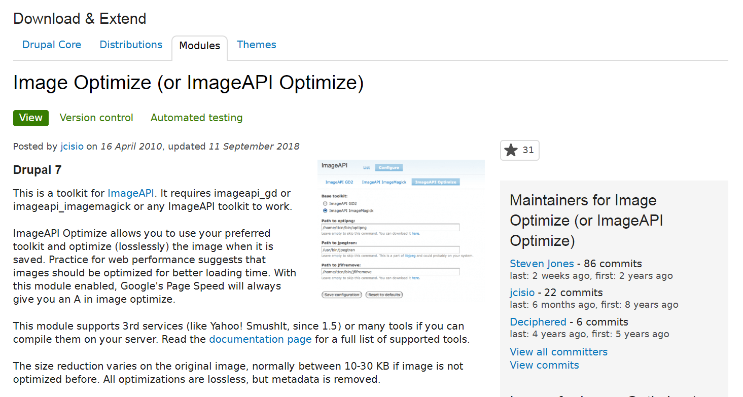
As with any other module, you’ll first need to download its tar.gz file. Then, you can install and enable the module in your dashboard.
After that, visit Administration > Settings > Imageapi, and choose ImageAPI Optimize as the default toolkit. You can configure the module’s settings from this page as well. This will automatically optimize any images on your site for mobile devices.
5. Add @media Rules for Image Sizes
Optimizing images reduces their file sizes. However, the amount of space an image takes up on the screen is important too. An 800 x 600 pixel image might look fine on a laptop screen – but what about on a 400 x 700 pixel phone screen?
Fortunately, you can use @media rules in Drupal to constrain images depending on each viewer’s screen size. To do that, you’ll need to:
- Ensure that the Breakpoint and Responsive Images modules are enabled.
- Set your ‘breakpoints’ using the Breakpoint Module. These are established screen sizes that you can use to create responsive layouts. For example, you could set one breakpoint for a typical laptop screen, another for tablets, and a third for cell phones.
- Visit the Responsive Images admin page to define image styles for each breakpoint. This will force your images to scale down when viewed on a smaller screen.
In addition, Google offers a free online course in how to create responsive images using HTML, CSS, and JavaScript. This can be useful if you want to learn more about how responsive images work, as well as some best practices for styling images on mobile devices.
Drupal Conclusion
As is hopefully clear by this point, optimizing your Drupal website for mobile devices is vital. An increasing number of users prefer browsing the web on their cell phones, and they may abandon your site if it takes too long to load, or looks distorted on their devices.
Fortunately, there are simple steps you can take to improve the appearance and performance of your mobile pages. You’ll want to:
- Install a mobile menu.
- Minify your code.
- Implement browser caching.
- Optimize images.
- Create rules to constrain image sizes.
Image credit: Pexels.


